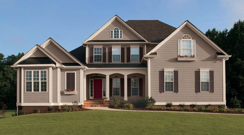
Are you the kind of contractor that gets excited about helping their customers choose exterior color scheme? If not, you can be. Make use of these six exterior color tips and you’ll find yourself talking more confidently about color in no time.
6 Secrets To Exterior Color Schemes
1. Identify key features
Using key features on a home is a great way to start thinking about an exterior color scheme.
Roof, brick, stone, stucco – these substrates can really impact paint color selection. For example, if the roof of the home or commercial property is a weathered wood type finish, try to select colors that are cooler, so they coordinate with the roof color. Additionally, if there’s a stone façade with sandy stone colors, think about warmer tones that will complement the earthy tones of the stone.
2. See what’s happening on the street
It’s a good idea to consider other houses or buildings in the neighborhood when recommending color. Look around, see what’s missing. It’s a great way to make your customer’s property looks distinctive. For example, urban planners, environmental designers and homeowner associations do this all the time to ensure that entire neighborhoods look amazing.
3. Create incredible curb appeal with exterior color schemes
One thing I like to do is play up significant architectural details on a house or commercial property. Maybe the building has incredible trim – pick a color to play that up. Maybe there are two forms of siding on a home – say, horizontal and shake. How about recommending two different body colors? Does your customer’s house have a gorgeous front porch? Try painting a bold color on the porch ceiling. Therefore, playing up key features is a good way to make a bold impression.
4. Put together a powerful palette
It’s not just about body or siding color. Think also about trim, doors and accents. For example, a great siding color can be enhanced by a dynamic accent color. If you have a neutral body color, try a bold and bright front door color. If the siding is going to be light, try a deep dark finish on the door. Four or five exterior colors will make some properties really shine. The key is to think about color harmony when creating a palette for your project.
5. Tap into historic exterior color schemes
History is a great guideline for color. So, as a general rule, historic color palettes feature rich colors and bold accents – perfect for shutters, front doors or even as a secondary siding color. Also, there are loads of resources online, in libraries or bookstores that talk about historic architecture and the appropriate color palettes per era.
6. Understand and utilize regional colors
Most regions of the country have fairly recognizable color profiles. The Southwest, for example, is known for dusty, earthy desert hues. Additionally, midwestern exteriors are typically traditional color schemes of neutral bodies, light trim and black, red, blue, grey or green shutters.
The East Coast is similar to the Midwest, but the schemes tend to have a historic feel. The Southeast is lighter and brighter due to all the sunshine and the Northwest favors cool neutral schemes, slightly darker than the Midwest.
Additionally in California, there is a predominant style of Spanish Mission.
In summary, a quick drive around will reveal how color is working in the neighborhood where you’ll be painting.
So Amigos, do you recommend any other exterior color scheme tips? Share below…
Also, check out Paint Amigo’s field color matching tool recommendation below (Amazon affiliate links)…
No products found.
P.S. Download my free eBook The Profitable Painter. Click here.


Painting is the best value return on investment. Great tips👍
I agree. Thank you!
Using a color scheme that can match our house’s historical design feels really impressive. Considering how our house is quite old and made out of a lot of terracotta, a classical design with brown and red would really work well for us. I’ll go and ask for this kind of palette when I work with an outside painting service in the area.